
Wednesday, 29 April 2015
Tuesday, 28 April 2015
Tuesday, 31 March 2015
Screening\ Audience Feedback
We showed our thriller to an audience of 16 to 18 year olds.


The following the question we asked to the audience:
- Did you understand the plot?
All of them said yes to this
- What did you like about it?
- The fact that there are "different camera angles" and that we "didn't show the main character in just one angle" and there is a "fluidity in the shots".
- Is there anything you didn't like?
Everyone liked the film.
- What would you change/add?
- The only criticism we got was that the "diegetic sound was not frequent enough".
- Was the music effective and how?
The music was effective and "added tension" there was "suspense from the start from the music"
Monday, 30 March 2015
Friday, 27 March 2015

Thursday, 26 March 2015
Wednesday, 25 March 2015
Tuesday, 24 March 2015
Monday, 23 March 2015

Friday, 13 March 2015
Third Day of Filming
This was our last day of filming. Here we shot the second scene of your film. Courtney did the sound as I filmed and directed the scene.


Tuesday, 10 March 2015
First Draft
The feedback we got was positive but we will need to make a few changes. For instance one person said that the editing needs to be smoother. We need to add more dissolves to tie in the scenes together better. But overall it was a good first draft.
Editing 2 & Title Sequence
Arsena and I, edited the last parts of our film. Here we added the titles and studio ident. We also added the appropriate music for our thriller including a sound effect at the end. With the titles we put them in the order film opening titles usually go by eg. the director at the end. We used the Adobe Premiere Pro software for the font and typing the names.


Saturday, 28 February 2015
Second Day of Filming
During this day we got another scene done, this was an improvisation of ideas, as our initial idea was not going to happen. We had our friend from outside our group to act as another agent. As half of the members of our group were absent. Arsena and I took on the scene ourselves, with some help from Barbara. I filmed, and held the boom mic as Arsena acted out the scene.


Tuesday, 24 February 2015
Tuesday, 10 February 2015
Making the Studio Ident
During this lesson I made a stop motion image of our initials on scrabble pieces. Together they make n,a,c and d which are the initials taken from Naomi, Arsena, Courtney and Diana. I took the photos of each scrabble piece as Diana moved them, to make it look like they were moving themselves. We ordered the scrabble parts on ebay where they can in 2 days.


Tuesday, 27 January 2015
Editing Our Film

We began editing the second half of our film, by putting all the scenes together. in one of our clips we had to delete some of the start for the shot to maintain continuity. We are planning to add the background music later on, when we have all of the filming done. Additionally, we have not yet filmed the first part of our film this will take place later.


Friday, 23 January 2015
First Day of Filming
We went out to London one day to film some shots for the second scene of our film. We planned to film at Liverpool Street Station, however because of legal circumstances we were unable to film under law. Thus, we went to a nearby spot near London Bridge to shoot. Because of the inconvenience of the train station we had to cut half of our scene out, that was compulsory for the station.


Wednesday, 21 January 2015
Modern Thriller Openings
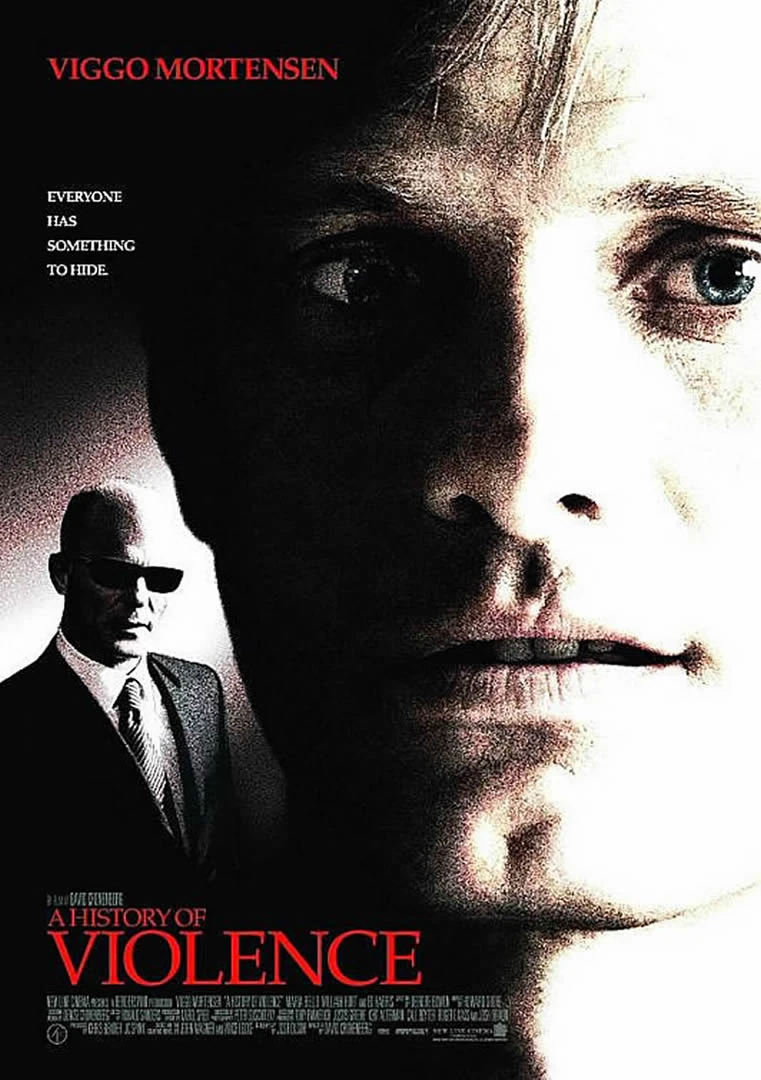
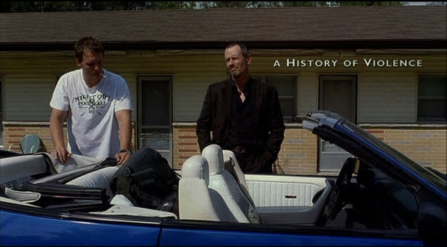
A History of Violence
The opening of this thriller starts tranquil and quiet. The pacing is very slow and creates a tedious effect, leaving the audience wondering what's going to happen. The scene is set in a small motel;the mis-en-scene of this opening makes the film seem desolate and deserted. The camera work is still and slow using a tracking shot to follow the characters. This opening fits in with the typical conventions of a thriller because it adds suspense because of how slow the pace is. Action then picks up when the opening comes to an ending. This leaves a short cliffhanger for the audience, questioning why the man killed all of those people in the hotel and why the man shot the child. Following the convention of tension, there is a part in the scene where we are left with one guy sitting in a car while the other goes into the reception. This leaves us clueless and left in the dark about what is happening. The sound of crickets is played continuously then transitions into loud dramatic music, this suggests an oncoming action sequence.


No Country for Old Men
The mis-en-scene is shown to be in a desert. The fact that it is set in the desert contributes the stranded feel the opening has, barely anyone is around creating an eerie atmosphere. The pace picks up with quick editing of an action sequence. Moreover, there's a gradual build up of sinister music being played in the background. Suggesting suspense is increasing and the main character becomes more and more ominous to the audience. During this scene there's various camera shots, to give the viewer an idea of the setting. Additionally, the use of camera shots is used to the advantage of the killing scene as it makes the scene more fast paced, increasing the adrenaline of the audience.


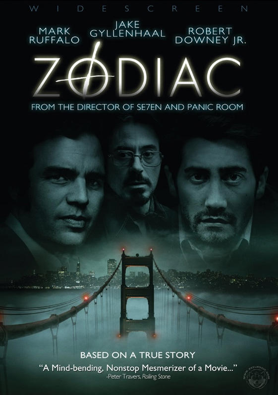
Zodiac
The opening of this film fits into the criteria of a thriller because it starts off normally, where the characters don't seem to be in any danger. The music is lighthearted and does not signify a crisis, which leaves the audience wondering what could go wrong - this can also gain suspense. The pace is prolonged as we are waiting for something bad to happen. As the killer shows up the editing pace slows down as there are quick shots from one person getting shot to the next. The music in the background progressively increasing and becomes louder, as the killer shots the young people. heightening the pace.


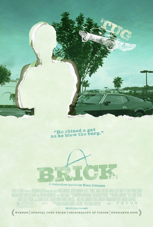
Brick
Brick starts in a culvert with a close up of a girl's arm lying presumably dead, with a teenage boy hovering around her. The atmosphere created makes the audience unclear of what is going on - generating suspense, this is shown in the beginning. When showing a series of close ups we are uncertain about what is taking place. Furthermore, the music of this opening is creepy and unsettling for viewers suggesting that the movie will create this tone throughout, or often. The blue tint of the scene shows a melancholy environment and a cold one too.


The opening of this thriller starts tranquil and quiet. The pacing is very slow and creates a tedious effect, leaving the audience wondering what's going to happen. The scene is set in a small motel;the mis-en-scene of this opening makes the film seem desolate and deserted. The camera work is still and slow using a tracking shot to follow the characters. This opening fits in with the typical conventions of a thriller because it adds suspense because of how slow the pace is. Action then picks up when the opening comes to an ending. This leaves a short cliffhanger for the audience, questioning why the man killed all of those people in the hotel and why the man shot the child. Following the convention of tension, there is a part in the scene where we are left with one guy sitting in a car while the other goes into the reception. This leaves us clueless and left in the dark about what is happening. The sound of crickets is played continuously then transitions into loud dramatic music, this suggests an oncoming action sequence.
No Country for Old Men
The mis-en-scene is shown to be in a desert. The fact that it is set in the desert contributes the stranded feel the opening has, barely anyone is around creating an eerie atmosphere. The pace picks up with quick editing of an action sequence. Moreover, there's a gradual build up of sinister music being played in the background. Suggesting suspense is increasing and the main character becomes more and more ominous to the audience. During this scene there's various camera shots, to give the viewer an idea of the setting. Additionally, the use of camera shots is used to the advantage of the killing scene as it makes the scene more fast paced, increasing the adrenaline of the audience.

Zodiac
The opening of this film fits into the criteria of a thriller because it starts off normally, where the characters don't seem to be in any danger. The music is lighthearted and does not signify a crisis, which leaves the audience wondering what could go wrong - this can also gain suspense. The pace is prolonged as we are waiting for something bad to happen. As the killer shows up the editing pace slows down as there are quick shots from one person getting shot to the next. The music in the background progressively increasing and becomes louder, as the killer shots the young people. heightening the pace.
Brick
Brick starts in a culvert with a close up of a girl's arm lying presumably dead, with a teenage boy hovering around her. The atmosphere created makes the audience unclear of what is going on - generating suspense, this is shown in the beginning. When showing a series of close ups we are uncertain about what is taking place. Furthermore, the music of this opening is creepy and unsettling for viewers suggesting that the movie will create this tone throughout, or often. The blue tint of the scene shows a melancholy environment and a cold one too.

Location
Location Visit Sheet
Film Title: Hitlist
Writer: Naomi,Courtney, Arsena and Diana
Director: Naomi Nuamah and Courtney Coote
Date: Friday 16th January - Saturday 17th January
|
| Access to location via:
Train, bus and walking
Name and number of location contact:
Liverpool Street
|
Health and Safety Issues to note:
|
Potential Filming Problems :
|
Additional Notes: (map of area/weather forecast etc)
The weather on Friday:  |
Tuesday, 13 January 2015
Our Third Production Meeting
In this meeting we finished drawing our storyboards and started working on planning the film using the documents. During this, we set a location and who is going to do what. We settled on what jobs we are all going to during filming. We came to the conclusion that I and Courtney will be the Directors. Arsena will be the actress and do the make up and costumes and Diana will be editing. We will also have an actor outside the group playing one of the characters.
Shot List
Shot List
| ||
Scene
|
Shot Number
|
Description
|
Wide shot
Close up
Close up
High angle
Wide shot
Pan
Tilt
Mid shot Close up Mid shot Long shot Shot-revers-shot (close up) Mid shot
Point of view
Close up and point of view Tilt and POV |
Of her face looking at the computer.
Her looking at the screen and then her point of view of whats in the screen.
The girl approaching the Printer
Of the pages coming out of the printer
Of the girls heels while she's walking away
Of her coming out of the door
Of her walking down the street
Over the crowed
The station
Of the crowded train station
Of the crowded the station
Girl amongst the crowd
Of the time table Of train going by Girl running for the train The girl running for the train and the train moving Girl bumping into the man The sheets on the floor The wanted sheet The man | |


Friday, 9 January 2015
Studio Idents
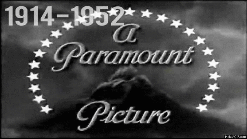
This company have evolved over the years as their logo possesses great change. As technologically had progressed so has the graphic elements in their logo. It has become more appealing to the present day audience. In 1914 the logo was in black and white also representing how the movies were filmed in that time. Staring with the 1952 logo, colour has been introduced. The studio logo now looks more modern and graphically more advanced. This logo shows how significant the studio is. The fact that there is a mountain illustrates the grandness and prestigious the production us.
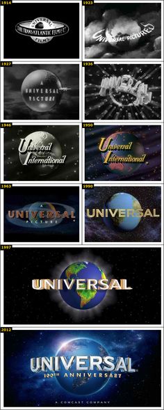
The universal logo has changed drastically from 1914 to 2012. Firstly, it introduced colour in 1930 like Paramount. This made he logo more appealing and pleasant to the eye. Also, originally the logo did not have the appearance of the earth and by 1923 it looked more like a globe. This represents their brand as it shows how they relate to people all around the world and are universal, hence the name. The logo shows a significance of the production company as it portrays the whole world suggestion that they have a great status and can be recognised around the world. The graphical element of the logo has also enhanced by 2012, including lots of detail and realism.
Independant film productions are more recent than the more major film productions. As they have been founded in more of the recent years from the late 90's to the 2000's. Therefore, there has not been much development in their studio ident. An example of an "indie" studio is Roadside Attractions, they begun in 2003. This logo has evolved in a way that is more appealing to the eye. The colour looks more professional and there is far more detail. The ident presents the studio as being a great studio because of how it is an eye-catching sign amongst the city skyline at the back, drawing the attention.

This is another indie film production, it is based in England. The 2D logo is very simple with a bold black logo. The lightening bolt going across the globe suggests even though they are a small company they have ambitions of making films all over the world. The logo does not show much use of CGI or colour, which shows how they are a low budget film company.

Monday, 5 January 2015
Subscribe to:
Comments (Atom)