Location Visit Sheet
Film Title: Hitlist
Writer: Naomi,Courtney, Arsena and Diana
Director: Naomi Nuamah and Courtney Coote
Date: Friday 16th January - Saturday 17th January
|
| Access to location via:
Train, bus and walking
Name and number of location contact:
Liverpool Street
|
Health and Safety Issues to note:
|
Potential Filming Problems :
|
Additional Notes: (map of area/weather forecast etc)
The weather on Friday:  |

Wednesday, 21 January 2015
Location
Tuesday, 13 January 2015
Our Third Production Meeting
In this meeting we finished drawing our storyboards and started working on planning the film using the documents. During this, we set a location and who is going to do what. We settled on what jobs we are all going to during filming. We came to the conclusion that I and Courtney will be the Directors. Arsena will be the actress and do the make up and costumes and Diana will be editing. We will also have an actor outside the group playing one of the characters.
Shot List
Shot List
| ||
Scene
|
Shot Number
|
Description
|
Wide shot
Close up
Close up
High angle
Wide shot
Pan
Tilt
Mid shot Close up Mid shot Long shot Shot-revers-shot (close up) Mid shot
Point of view
Close up and point of view Tilt and POV |
Of her face looking at the computer.
Her looking at the screen and then her point of view of whats in the screen.
The girl approaching the Printer
Of the pages coming out of the printer
Of the girls heels while she's walking away
Of her coming out of the door
Of her walking down the street
Over the crowed
The station
Of the crowded train station
Of the crowded the station
Girl amongst the crowd
Of the time table Of train going by Girl running for the train The girl running for the train and the train moving Girl bumping into the man The sheets on the floor The wanted sheet The man | |


Friday, 9 January 2015
Studio Idents
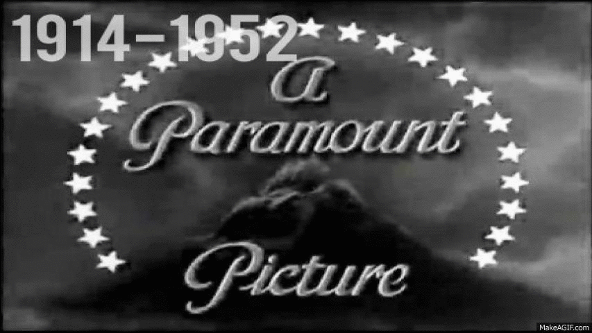
This company have evolved over the years as their logo possesses great change. As technologically had progressed so has the graphic elements in their logo. It has become more appealing to the present day audience. In 1914 the logo was in black and white also representing how the movies were filmed in that time. Staring with the 1952 logo, colour has been introduced. The studio logo now looks more modern and graphically more advanced. This logo shows how significant the studio is. The fact that there is a mountain illustrates the grandness and prestigious the production us.
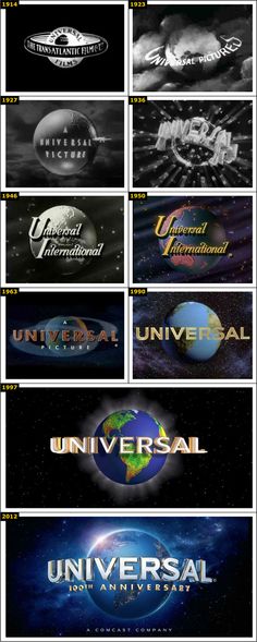
The universal logo has changed drastically from 1914 to 2012. Firstly, it introduced colour in 1930 like Paramount. This made he logo more appealing and pleasant to the eye. Also, originally the logo did not have the appearance of the earth and by 1923 it looked more like a globe. This represents their brand as it shows how they relate to people all around the world and are universal, hence the name. The logo shows a significance of the production company as it portrays the whole world suggestion that they have a great status and can be recognised around the world. The graphical element of the logo has also enhanced by 2012, including lots of detail and realism.
Independant film productions are more recent than the more major film productions. As they have been founded in more of the recent years from the late 90's to the 2000's. Therefore, there has not been much development in their studio ident. An example of an "indie" studio is Roadside Attractions, they begun in 2003. This logo has evolved in a way that is more appealing to the eye. The colour looks more professional and there is far more detail. The ident presents the studio as being a great studio because of how it is an eye-catching sign amongst the city skyline at the back, drawing the attention.

This is another indie film production, it is based in England. The 2D logo is very simple with a bold black logo. The lightening bolt going across the globe suggests even though they are a small company they have ambitions of making films all over the world. The logo does not show much use of CGI or colour, which shows how they are a low budget film company.

Monday, 5 January 2015
Subscribe to:
Posts (Atom)